Overview
The Recapped marketing website was designed as a natural extension of the product itself, carrying the same principles of simplicity, warmth, and intentionality into a public-facing experience. Rather than relying on traditional marketing tactics or long feature lists, the site focuses on helping visitors quickly understand what Recapped is and how it might fit into their everyday lives.
Because Recapped is intentionally open-ended, the website needed to communicate flexibility without creating confusion or overwhelming users with possibilities. To achieve this, the experience leads with emotion and familiarity, grounding the message in common human moments like forgetting, remembering, and collecting meaningful information over time. Clear language, generous spacing, and a calm visual rhythm reflect Recapped’s role as a supportive companion rather than a demanding productivity tool.
Recapped: Marketing Website
Overview
The Recapped marketing website was designed as a natural extension of the product itself, carrying the same principles of simplicity, warmth, and intentionality into a public-facing experience. Rather than relying on traditional marketing tactics or long feature lists, the site focuses on helping visitors quickly understand what Recapped is and how it might fit into their everyday lives.
Because Recapped is intentionally open-ended, the website needed to communicate flexibility without creating confusion or overwhelming users with possibilities. To achieve this, the experience leads with emotion and familiarity, grounding the message in common human moments like forgetting, remembering, and collecting meaningful information over time. Clear language, generous spacing, and a calm visual rhythm reflect Recapped’s role as a supportive companion rather than a demanding productivity tool.
Our Strategy
Designing the Recapped marketing website required a careful balance between clarity and openness. Because the product is intentionally flexible, the risk wasn’t under-explaining — it was saying too much. Overloading the site with examples or tightly defined use cases would have undermined the very quality that makes Recapped valuable.
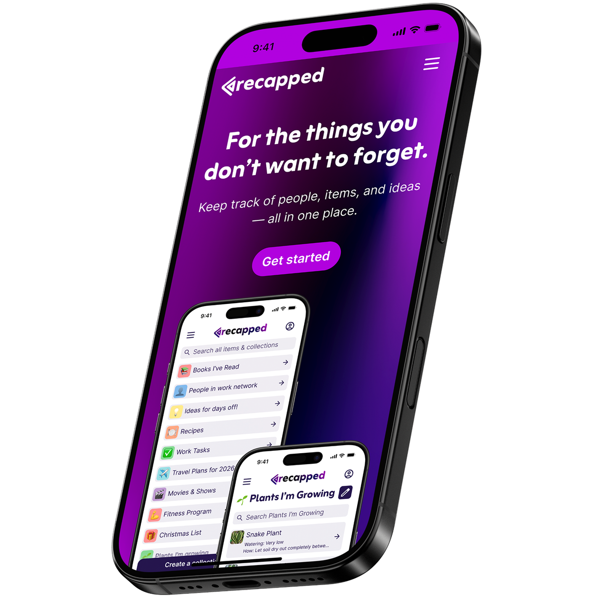
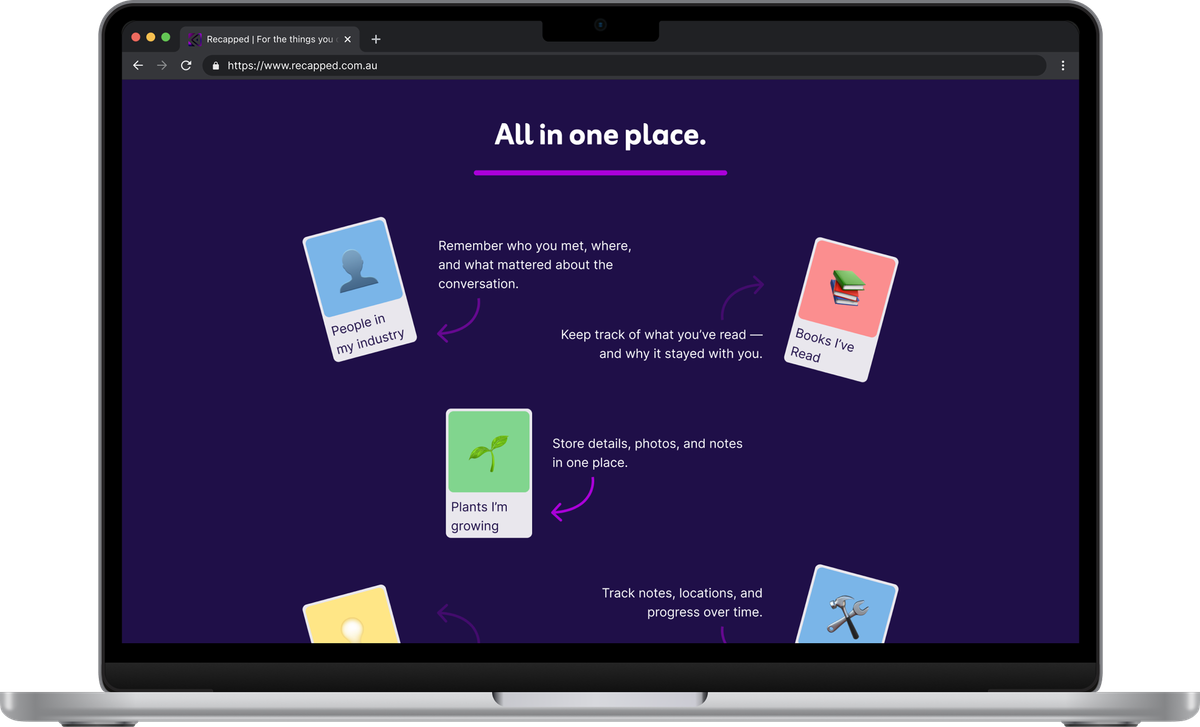
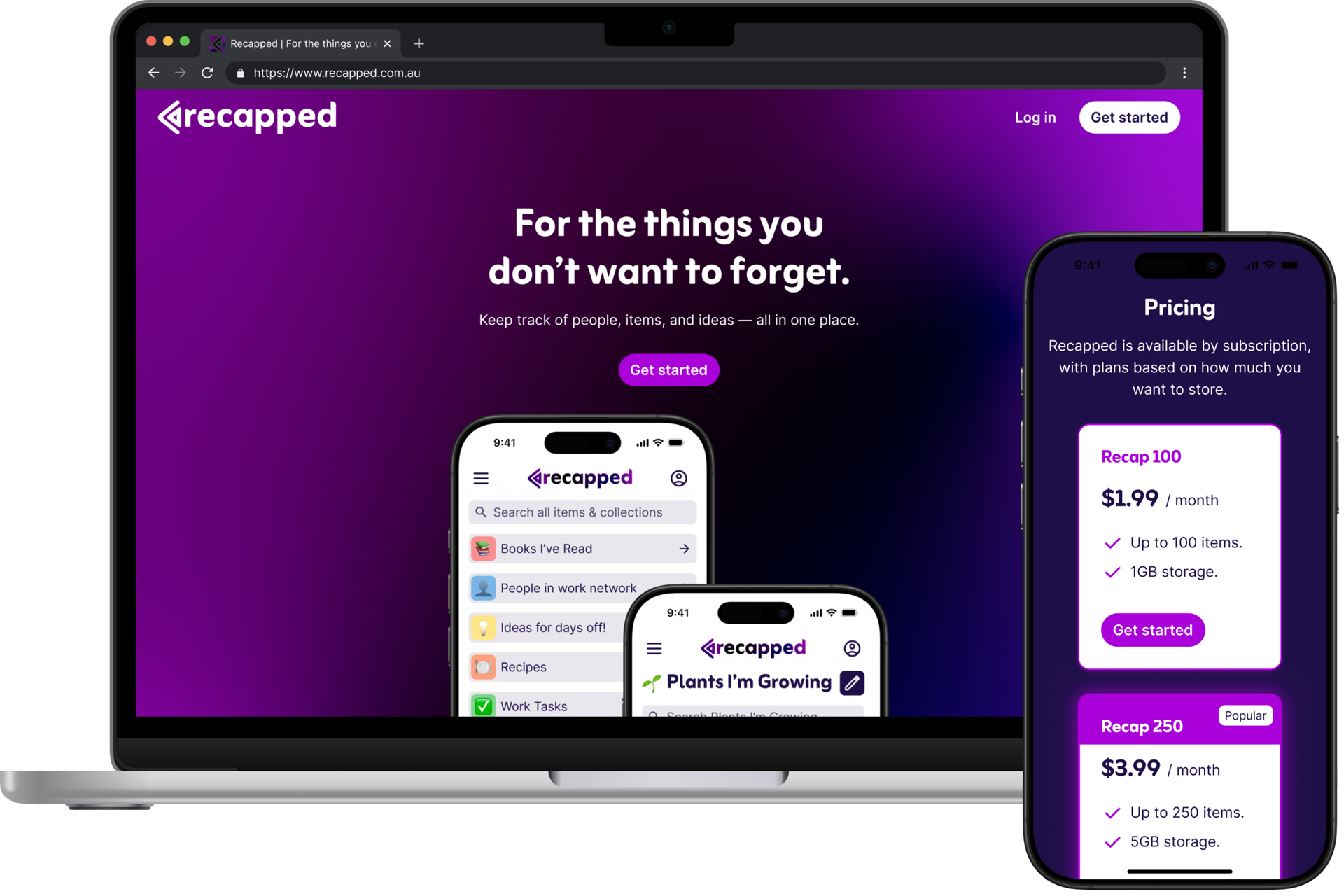
The approach focused on creating space for interpretation rather than instruction. Instead of relying on feature breakdowns, the website uses real interface moments and familiar content to quietly demonstrate how the product works. This allows visitors to recognise their own needs within the experience, without being told how Recapped should be used.
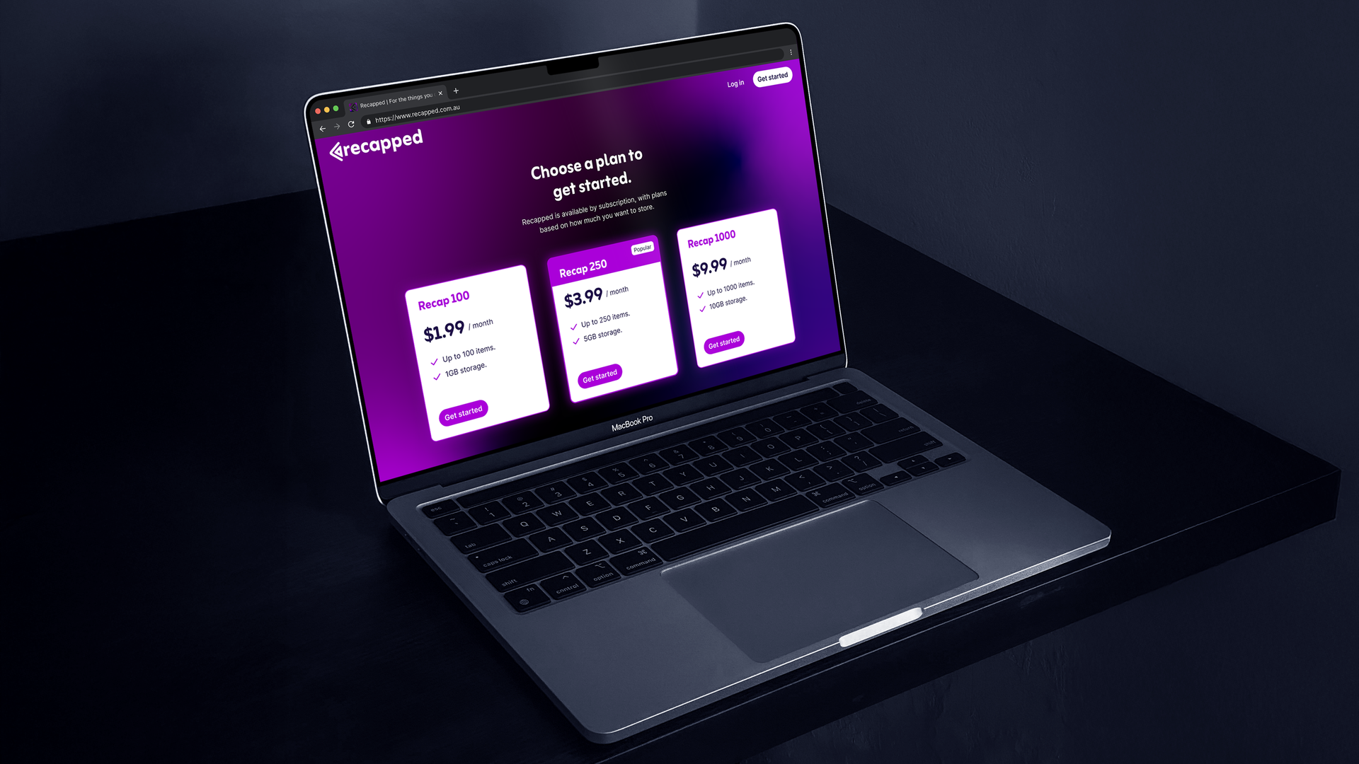
The visual language reinforces this philosophy. A restrained colour palette, soft gradients, and generous spacing reflect the calm, considered nature of the product. Content is organised into a clear progression that builds understanding gradually, leading users from curiosity to confidence without friction. Simple, transparent pricing and responsive layouts complete the experience, ensuring the site feels approachable, trustworthy, and aligned with Recapped’s intention to be useful without being demanding.
The Results
The finished marketing website presents Recapped with clarity and restraint, allowing the product to speak for itself. By avoiding heavy explanations or prescriptive messaging, the site builds trust quickly and makes the value of Recapped easy to understand without overwhelming visitors. The experience mirrors the calm, considered nature of the product, creating a seamless transition from first impression to in-app use. Clear narrative flow, transparent pricing, and responsive layouts support a smooth journey across devices. Ultimately, the website positions Recapped as a flexible, user-defined tool rather than a feature-led product, reinforcing its broad appeal and thoughtful design intent.
“We designed the site with the same restraint as the product, letting simplicity do the heavy lifting.”
Juliet Gobran
Product Designer / Go To Apps