Overview
When Footprints Maps first approached us, they envisioned a clean, minimal brand and entirely black and white. While this direction aligned with simplicity, it didn’t yet capture the spirit of exploration, the vibrancy of the Australian coast, or the sense of adventure at the heart of their product. Our goal was to develop a brand identity that felt grounded in real Australian landscapes, emotionally resonant, and instantly recognisable. By drawing inspiration from coastal tones, iconic travel culture, and the storytelling power of analogue photography, we crafted a brand that blends seamlessly into the natural environment while still speaking boldly to travellers.
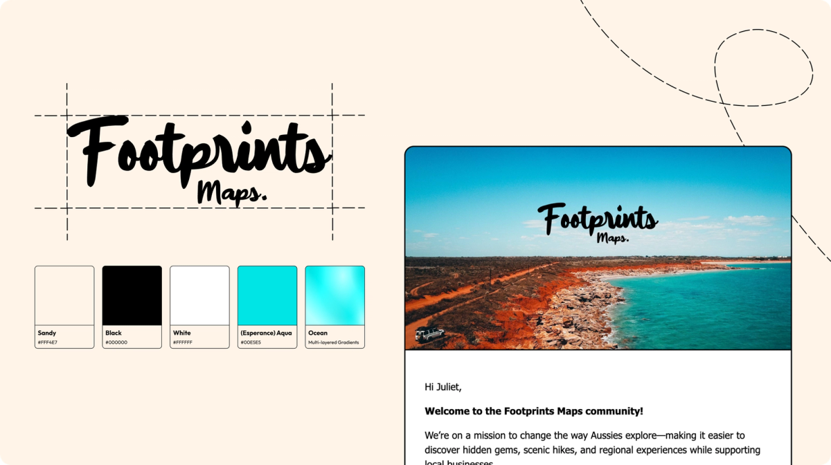
Footprints Maps: Visual Identity
Overview
When Footprints Maps first approached us, they envisioned a clean, minimal brand and entirely black and white. While this direction aligned with simplicity, it didn’t yet capture the spirit of exploration, the vibrancy of the Australian coast, or the sense of adventure at the heart of their product. Our goal was to develop a brand identity that felt grounded in real Australian landscapes, emotionally resonant, and instantly recognisable. By drawing inspiration from coastal tones, iconic travel culture, and the storytelling power of analogue photography, we crafted a brand that blends seamlessly into the natural environment while still speaking boldly to travellers.
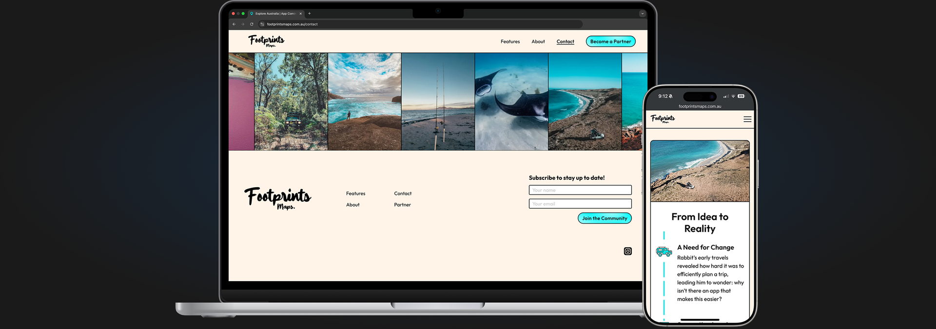
Our Strategy
We set out to evolve Footprints Maps from a simple black-and-white concept into a brand that feels naturally at home on the Australian coast. The goal: a palette that blends into real landscapes, reflects the culture of exploration, and adds personality without overpowering the product.
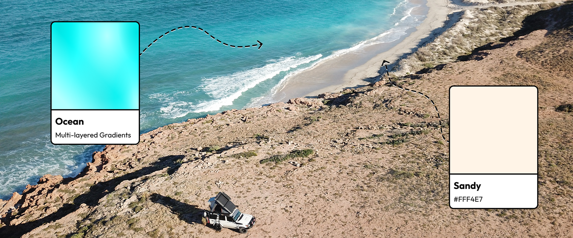
Sandy — Warm, Familiar, Adventure-Ready
Inspired by the iconic Sandy Taupe Land Cruiser, Sandy (#FFF4E7) brings warmth and authenticity to the brand. It echoes dunes, dusty tracks, and Australia’s rugged touring culture—creating a natural, understated backdrop that lets maps and photography take the lead.
Ocean — The Energy of Esperance
Ocean is a multi-layered gradient crafted after Rabbit’s request for buttons that “look like the ocean.” Drawn from the vivid blues of Esperance, it adds movement and vitality to the palette—balancing Sandy’s softness with a refreshing coastal hit.
The Results
The refreshed brand identity elevated Footprints Maps from a simple, minimal concept into a vibrant, grounded, and emotionally resonant adventure brand. The Sandy/Ocean palette created immediate recognisability and a consistent visual thread across their web presence, marketing assets, and app development.
The new identity celebrates exploration without overpowering it—allowing real Australian landscapes and user experiences to remain at the forefront. Footprints Maps now has a brand that feels at home on the coastline, in a 4WD, or in the hands of travellers discovering new places.
"The ocean tones and the sandy beach colours capture Australia's coastlines perfectly, and the team really nailed the essence of what we’re building."
Combi
Co-Founder / COO / Footprints Maps